fedora 36

Fedora 36 Beta Update

The final F36 day and night beta wallpapers are here! Take a look below and let us know what your thoughts are!

Day version of the wallpaper download here


We last left off with the beta versions of the wallpaper that were created in Krita, which can be found here with their design process explained.

We received a lot of great feedback including suggestions for a strictly night version with the moon glowing instead of a sunset, adding butterflies to the day version, as well as shifting some of the clouds around so they didn’t stack and make the right side of the wallpaper too heavy. The previous version is below in Day, Sunset, and Night mode.

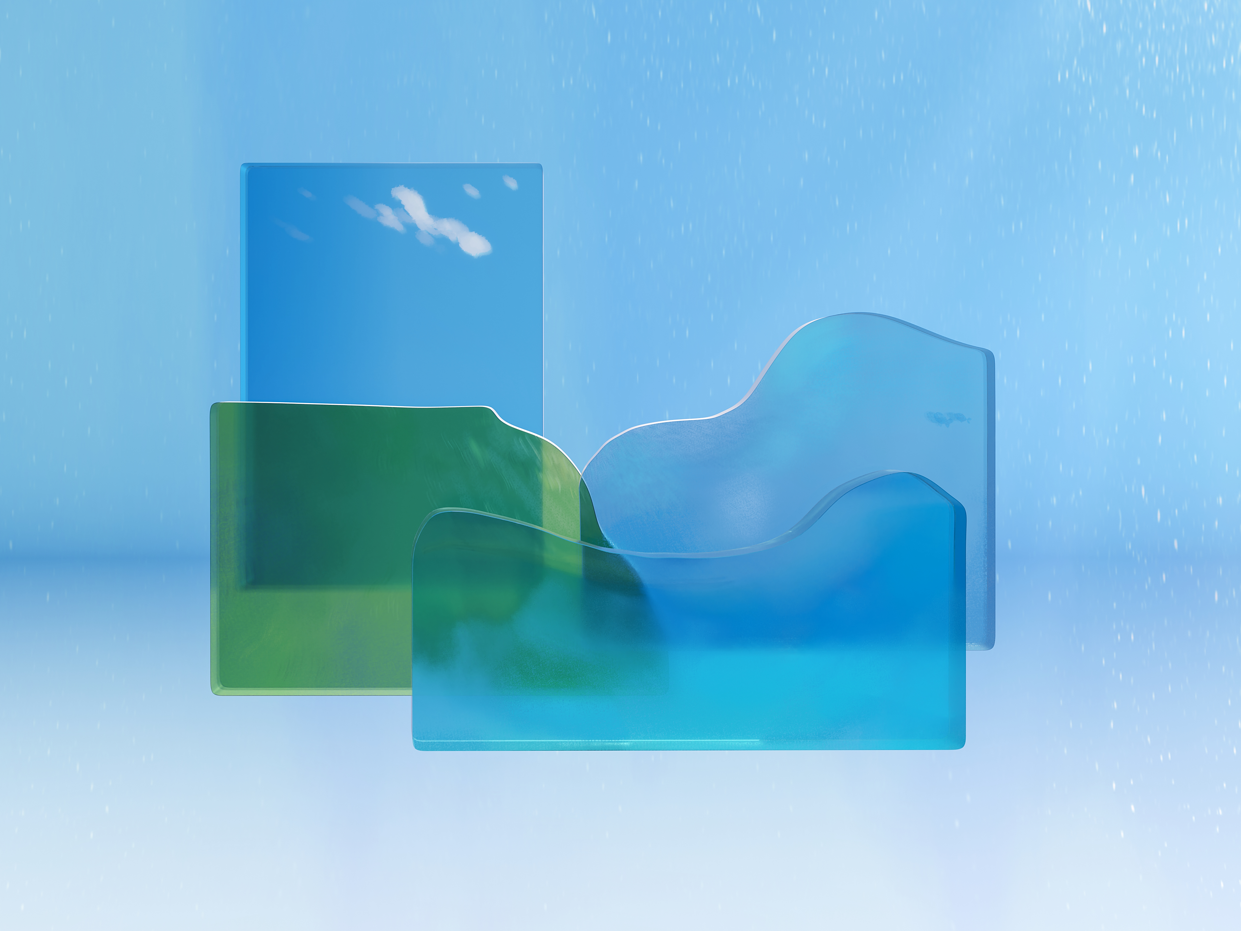
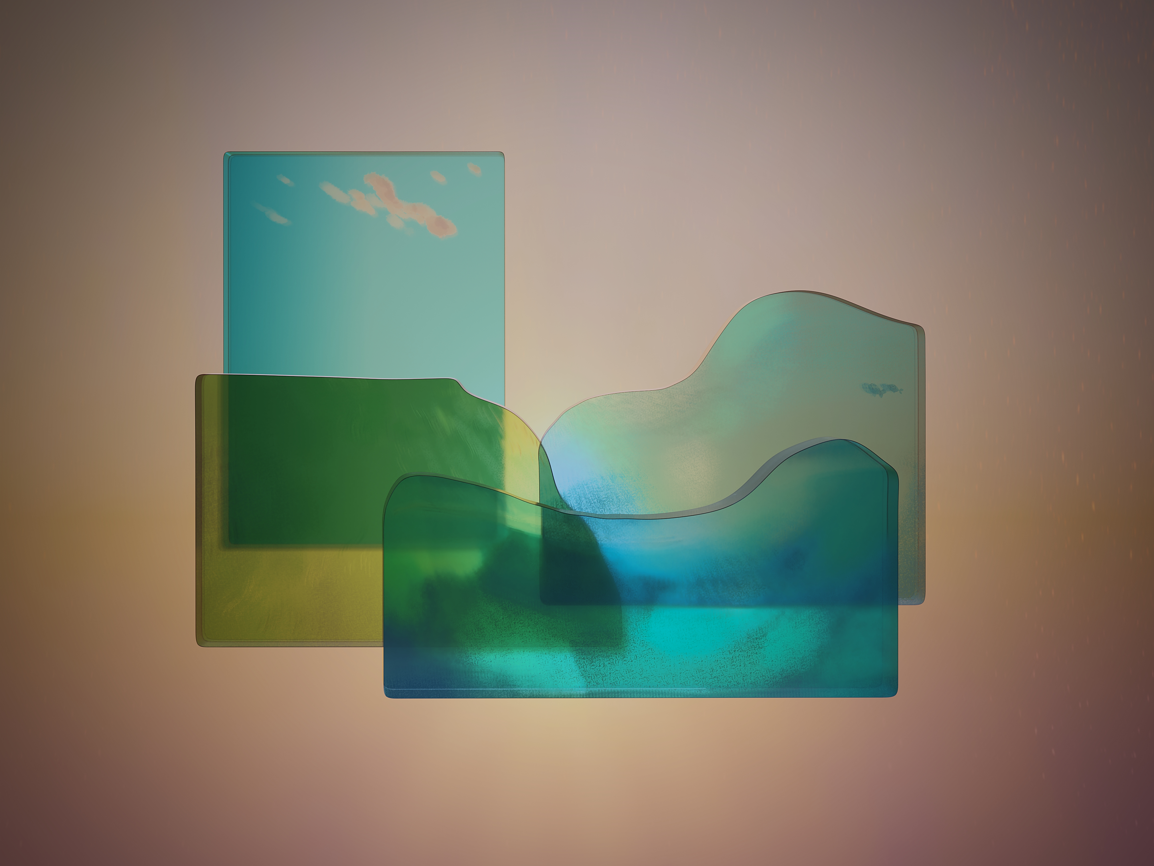
After the first beta wallpapers were completed we were able to start to play around in Blender. Máirín Duffy created the image below demonstrating the idea of the glass planes layered in front of each other with a light source.

Máirín then moved on to approximating something that resembled the previous versions.

Here are some of the tutorials she followed:

Creating the grass (just green hair particles. Couldn't use the texture they cite because the scale is off, blades of grass are the size of the trees, and couldn't figure out how to scale the texture) - https://www.youtube.com/watch?v=jOS9k6kqBsc

Creating the glass materials - https://www.youtube.com/watch?v=CtfNtpJa3hU

Creating the clouds - https://www.youtube.com/watch?v=lPAYX8z9i8M

She noted there were some issues,

”The grass looks horrible like green hair on a bald person! I had the material as a base green color and that stopped working.
I have a pretty nice, blue cloud off on the side. That could be duplicated to make the real clouds white. I colored it blue thinking I'd put it inside the front light blue water to make it look cloudy.
The middle blue glass does not shine through the front blue glass... it's as if it's not there. But the green mountain layer does shine through. I can't figure out why.
The lighting is a train wreck.”
- Máirín

Our blender expert Micah Dunn was able to start playing around and pulled the textures from the first beta versions in a simpler manner.

Experimenting with how thick the panes of glass should be.

The Fedora Design Team meets once a week and if you want you can watch the recording from March 9th’s recording here at the 16:30 minute mark.


Until this final version of the day wallpaper was produced!

The F36 default wallpaper in Fedora 36 uses a new feature called light/dark mode, where you can put your entire desktop into a light or dark mode and the wallpaper lightens or darkens to match the desktop UI.

You will need a build of Fedora 36 to test the wallpapers alongside this new functionality, but you can also just download and set the wallpapers from this blog post on any version of Fedora or any desktop to test them out as wallpapers.

If you are a beta tester for Fedora 36 or would like to test this wallpaper's light/dark functionality, the update with the new artwork is here: https://bodhi.fedoraproject.org/updates/FEDORA-2022-30419fe922

If you have the testing updates repository enabled on your system, you should be able to grab it by simply running 'sudo dnf update f36-backgrounds -y'

You can grab the latest Workstation ISO for F36 here: https://kojipkgs.fedoraproject.org/compose/36/latest-Fedora-36/compose/Workstation/x86_64/iso/Fedora-Workstation-Live-x86_64-36_Beta-1.4.iso

You can run this in a VM tool such as GNOME Boxes on Fedora, and once it is booted, open a terminal and run 'sudo dnf update f36-backgrounds -y'

Simply, you'll be able to install the update with the following command:

sudo dnf upgrade --enablerepo=updates-testing --advisory=FEDORA-2022-30419fe922

Leave your feedback here on fedoraproject.org.

Mid February Update

Well! The biggest update is the day and night versions have been finalized for the beta release of Fedora 36. Obviously we chose Deepika Kurup to inspire the wallpaper and had a mind map session as well as some thumbnails that steered us in the right direction.

We kept in mind the concepts we’d talked about at our first mind mapping session, Nature/Water Cycle, Transparency/Reflection, and Filter/Purification. Eventually we discussed an artist called Nobuhiro Nakanishi, who’s layered artwork uses rectangular glass plates to create immersive landscapes that form a wide landscape.

Mo proposed, “layered shaped glass textured landscape, maybe vertically taller than Cathedral Dusk to show layers of ocean or layers of soil beneath.”

I could draw the landscape’s textures to hand over to Micah who could take them into blender. Like an artist creating a fabric’s design, and handing over the finished fabric to someone who can drape it on the mannequin into an outfit.

I came up with the abstract landscape below based off the surrounding inspiring imagery. Each part of the landscape would be partially transparent pane and because it was digital, we could have clouds and parts that wouldn’t logistically make sense in the real world.

So where were we last week? I had the general landscape figured out, some of the trees blocked in with leaves texture, but the three blocks of land and water still needed attention and I was having a tough time rendering the clouds.

So I decided to just turn that layer off so I could hopefully come up with a better cloud rendering.

To create this landscape in Krita, I used a bunch of clipping layers. For example with the grass. I used the selection tool to draw a shape, used the bucket tool to fill it, and then you do ctrl shift g to create a clipping group folder. Once the clipping layer is on you can only draw on that shape. If you try to draw outside of the shape it won’t show up. And the beauty of it is you can have multiple clipping layers on an object.

Which is great because if you want to change an aspect of it later on, like the base color to be darker or a different color it won’t erase all your hard work painting the texture.

Instead of making cloud shapes with the bucket tool and painting within that shape- I decided to use a transparent brush to softly bring them to life and keep them lighter and loose.

The background clouds were the first ones I was happy with and once I added the fake light source in the back it started to pull a lot of the elements together. Having that common theme of a little yellow light was helpful.

Then Mo reminded me that it needed a different dimension so the canvas size had to be changed.

Lots of little changes went on in between these two images. Added the front clouds, the little fish, the rest of the trees, the leaves texture, and more detail in the grass.

For the night version, I thought about taking it into gimp but because I already had all the elements in individual folders I started off by just duplicating the file. And since most of them had masking layers I could either change the base color, like with the sky, or I could just add a blue tint over the whole part.

Each pane got different levels of blue to try and keep the levels of contrast. I moved the fish to imply they were swimming somewhere different now, as well as the clouds.

I’ve already gotten a great amount of feedback on both of these! Taking this night version, which is honestly more like a dusk version, and making the sun into the moon to take it full nighttime mode has been suggested. Moving the clouds on the right so it’s not such a heavy stack of clouds is going to happen.

And for the day version playing around with the blue sky, potentially adding butterflies or birds, and looking at the trees on the right to see if they work better as islands over the blue water instead of being enveloped by the wave.

I worked on a few other things but this was the majority of my past week so wanted to lay it all out :)