
The Goal:
When a new project or design request came to me, I would brainstorm ideas and document them on the ticket. Afterwards, the plan was to put the project prompt into AI and compare the AI-generated ideas to my own. If an AI idea had potential, I would build upon it.
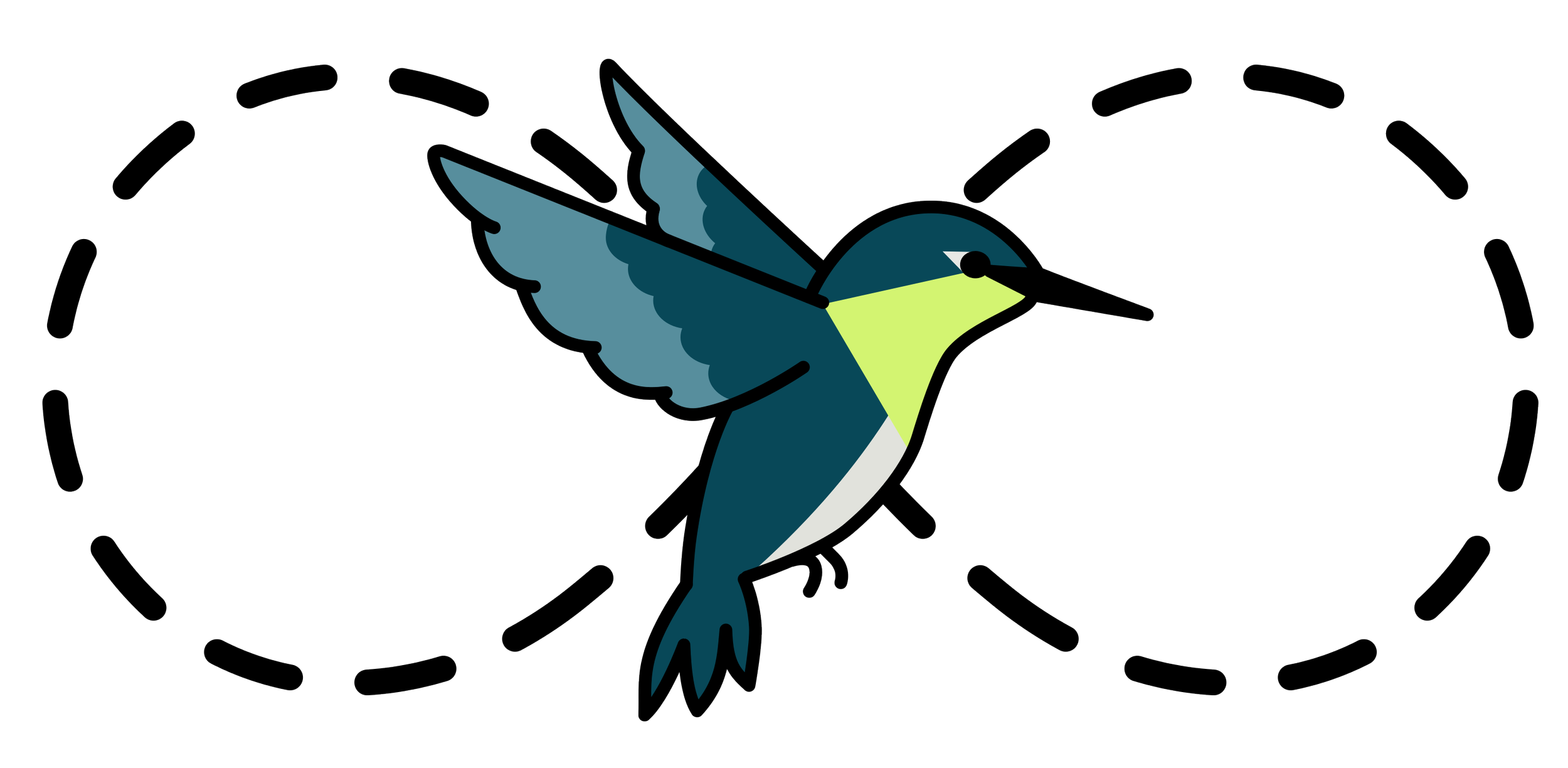
Hummingbird Logo
Core principles for the project from the team:
Minimalist images contain only the bare essentials and follow distroless principles to reduce the attack surface.
Hardened by Default, Packages are compiled with a full suite of modern security flags and common hardening/compliance configurations.
Familiar Developer Experience Hummingbird images are designed for seamless integration with existing CI/CD pipelines and developer workflows.
Upstream Proximity Security fixes are delivered quickly from the latest upstream releases, with a target time to remediate of less than 24 hours for CVEs.
Read here to follow the documentation of the ticket.
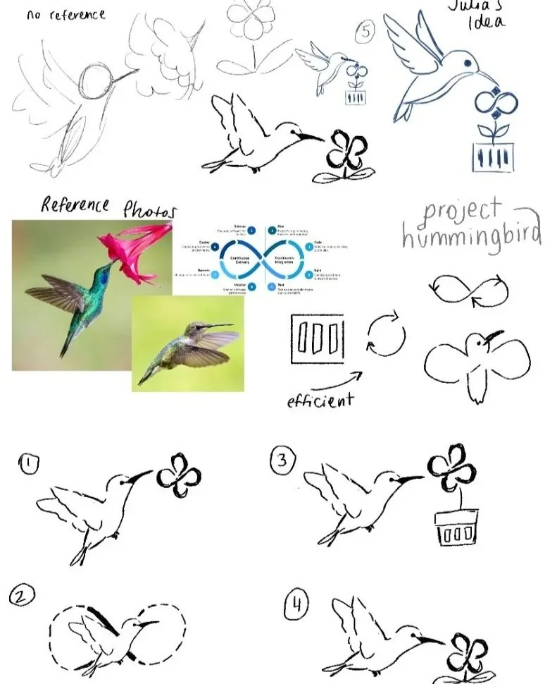
My first iteration of ideas before I put the prompt into AI
option 1

option 2
option 3
option 4
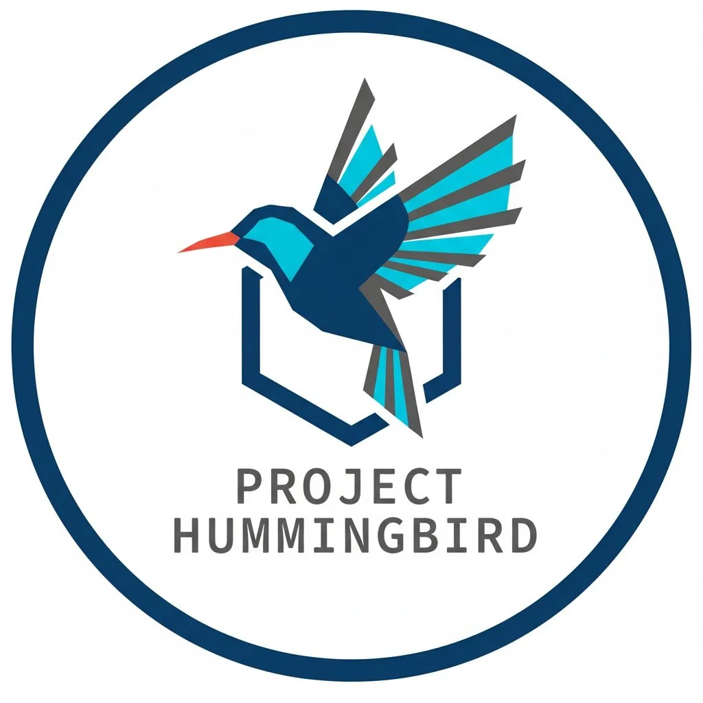
Me: Asking for a logo for our minimal, hardened container that we are calling Project Hummingbird. Inspired by the style of logos that were used for Podman, Bootc, and the whole container tools projects. Can you make us a hummingbird one?
AI: Here’s option 1. The geometric, sharp lines of the bird suggest precision and control.
*I like the idea of a shield behind the bird, and someone else from the team also recommends the symbol to be considered*
Me: Can you make it more cartoony?
AI: Here is option 2!
Me: It looks like just a drawing of a hummingbird. Can you incorporate more of the core principles and visuals from CI/CD pipelines?
AI: Here’s Option 3. I'll aim for a style that's more cartoony but brings back the structured, technical feel of CI/CD and the project's core principles. I’ll think about elements like movement, containment, speed, and minimalism.
Me: It's too detailed for a logo. Can you make it simpler?
*multiple back and forths with little to no change or improvement*
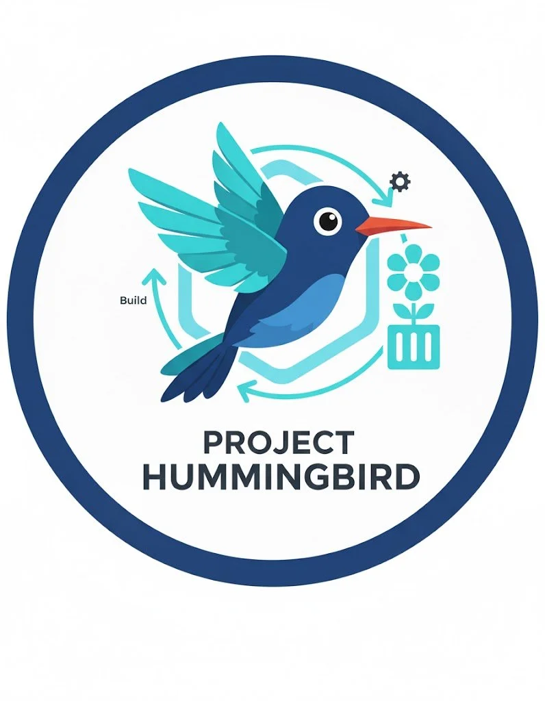
Me: Can you make a logo that’s inspired by efficient CI/CD with a nature theme
AI: Here's Option 4. A logo concept inspired by the "efficient" symbol from your mindmap, merged with a nature theme.
*I was trying to understand what about this, besides the color palette and obvious bird, was coming across as nature.*
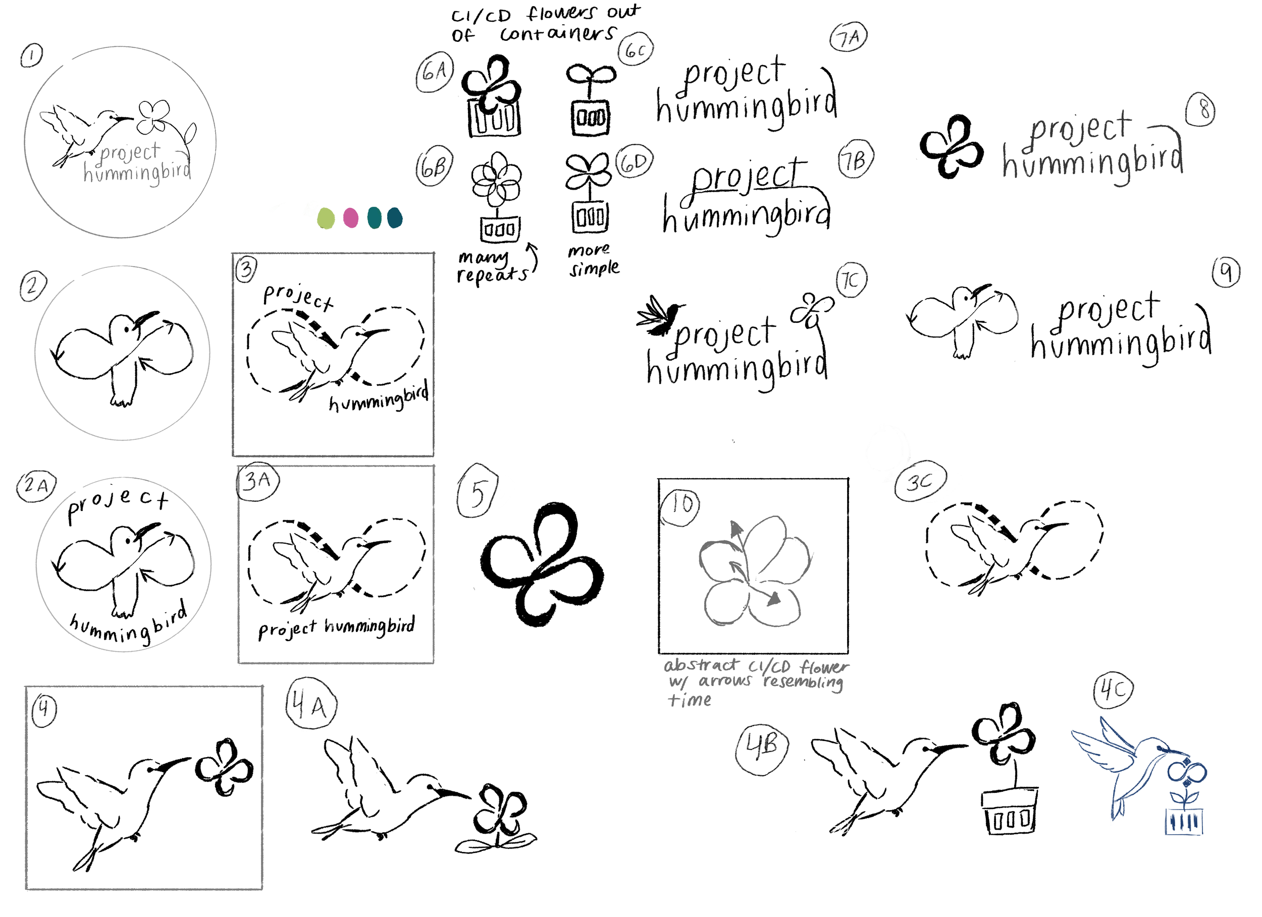
Human-made intermission: This was how my sketches looked as I received feedback from the team.

Me: Can you merge a four petal flower with a hummingbird? (We were throwing around the idea of a CI/CD loop flower)
AI: Here is option 5!
Post AI Thoughts:
I wasn’t super impressed with what the AI was spitting out. I know that AI is a tool like any other, so it requires good prompts. Every time I used it, though, all I could think about was the water consumption involved with each prompt, so I tried to be as intentional and succinct as possible with my requests.
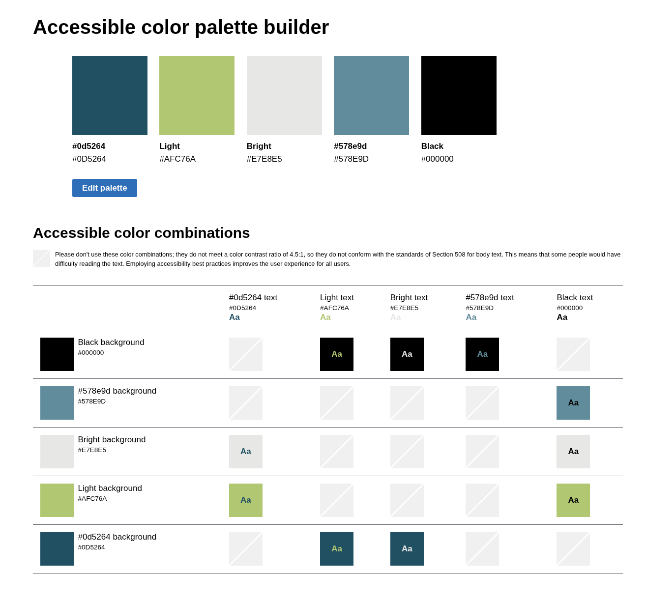
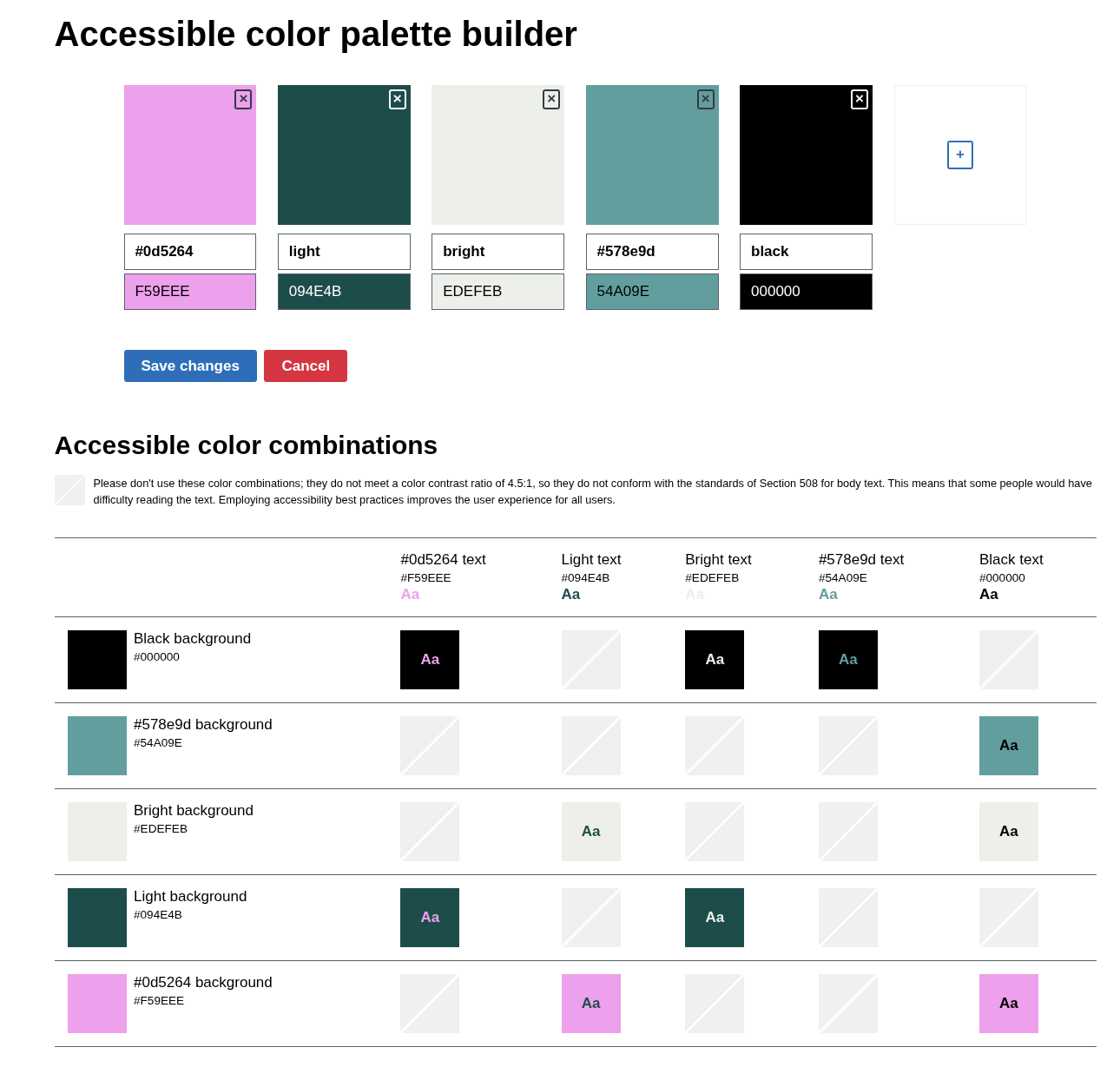
I also noticed that with the hummingbird options, the AI model used the same color palette across all options, with not much variation at all. This was a stark difference between my intention and thought behind the color palettes I suggested that I also made the effort of running through an accessibility checker.
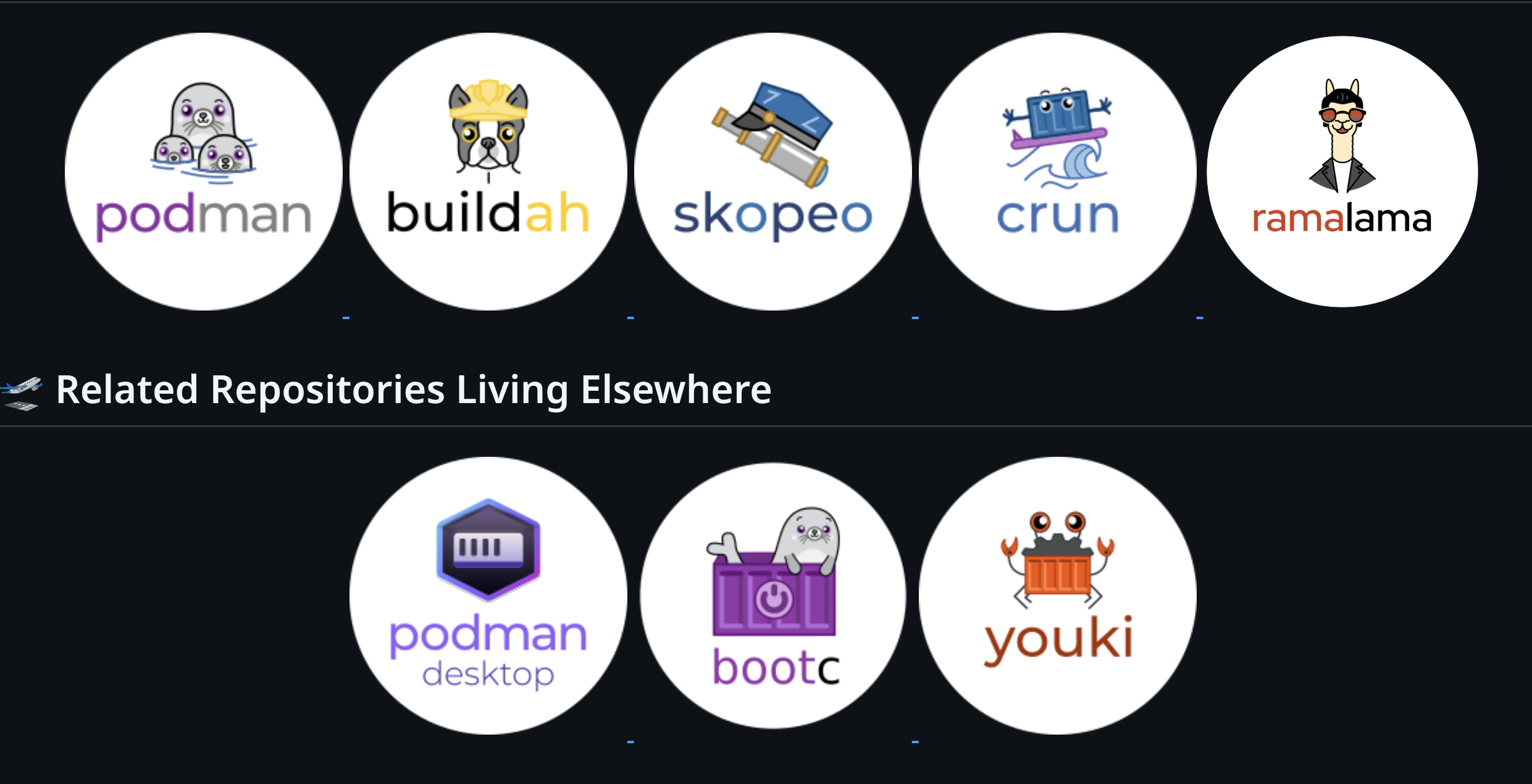
I didn’t feel like any of the AI-generated images left a lasting impression on me either. Option 3 was too busy, and Option 2 was cartoony but a little weird looking, while Option 1 was too geometric; none could truly replicate the styles that were used for the container tool logos (Like Bootc or Podman).
Admittedly, I found myself almost hoping that the AI model wouldn’t be able to recreate the original styles as well as a human artist could, in part because it puts me in an awkward position as an artist myself, especially as one of the designers who made some of the container tool logos. At the current stage of AI, these models still seem incapable of doing as good a job at creating unique, thoughtful designs compared to humans.
AI works the best as a research tool right now for me, but it comes with the caveat of having to then fact-check the AI model, so am I really saving time?
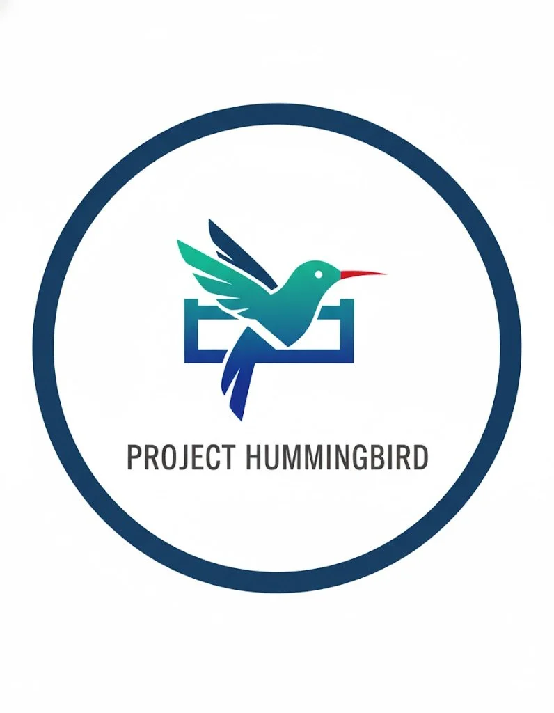
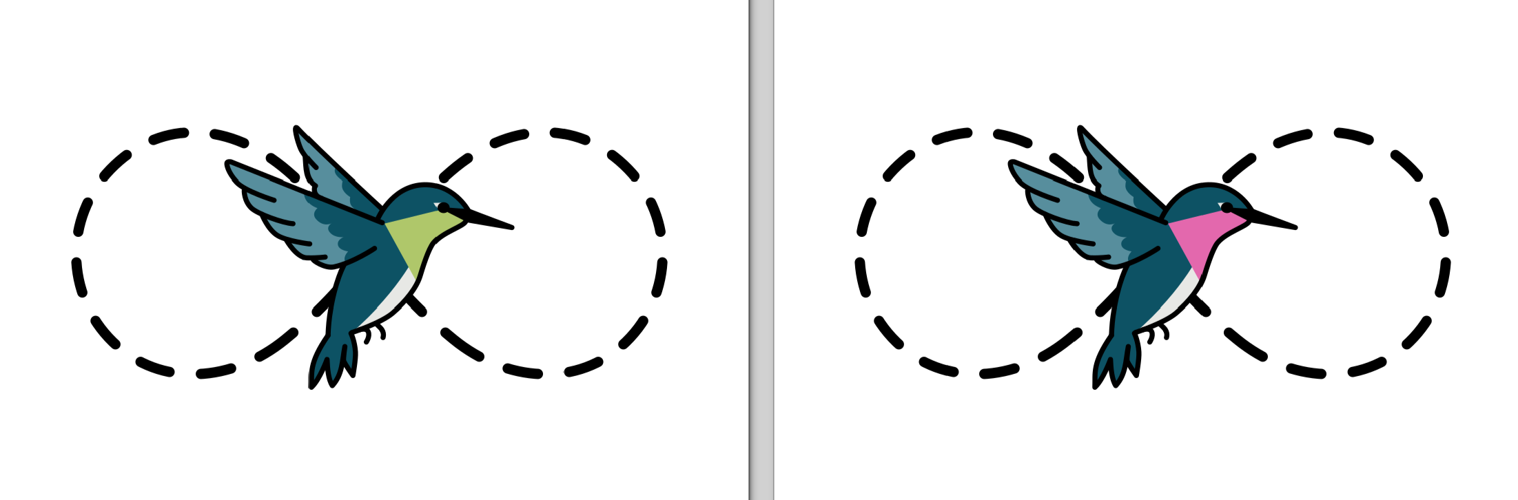
One of the final logo iterations I made for the team
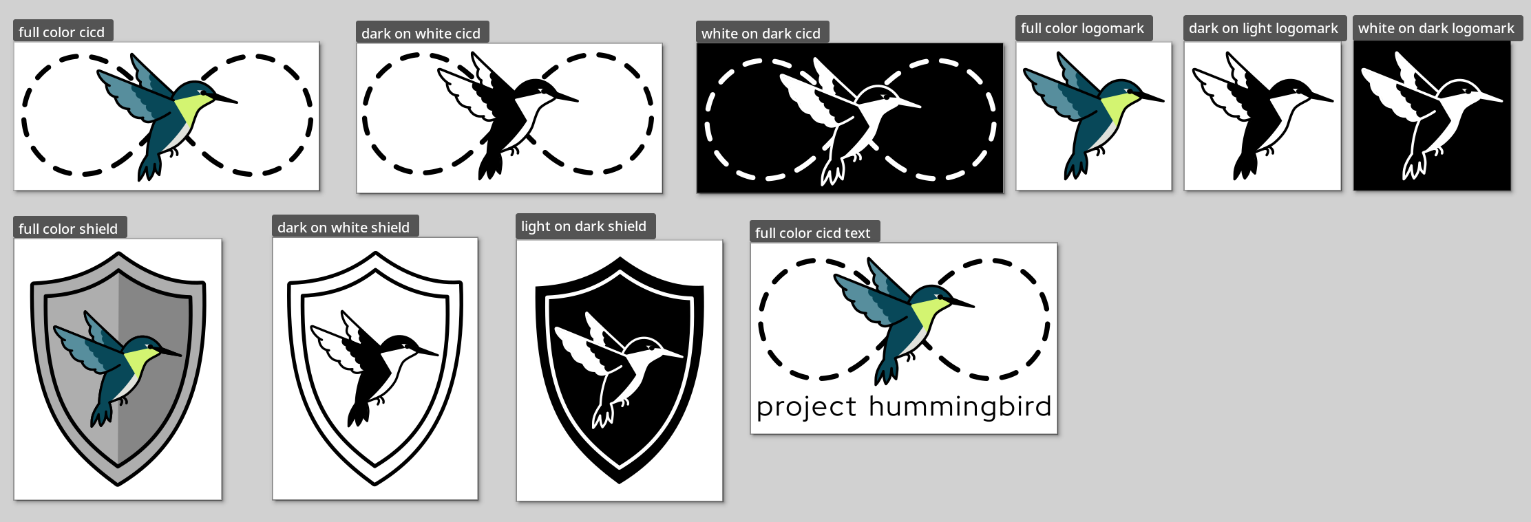
All of the final logos that I handed over to the Hummingbird team
Conmon Logo
Request:
“Conmon still doesn't have a logo which makes it one of the last container related utilities without a face. Given the nautical/sea theme for the rest of container tools, maybe a submarine/periscope like thing would work?”
Read here to see the documentation of the logo process.
My first information search:
Conmon is a monitoring program and communication tool between a container manager (like Podman or CRI-O) and an OCI runtime (like runc or crun) for a single container.
Upon being launched, conmon (usually) double-forks to daemonize and detach from the parent that launched it. It then launches the runtime as its child. This allows managing processes to die in the foreground, but still be able to watch over and connect to the child process (the container).
Ideas include:
Periscope
Submarine
Sonar
Me: Please make a logo for Conmon Utility, also known as Conmon. Conmon is a monitoring program etc etc.
AI: Here is Option 1.
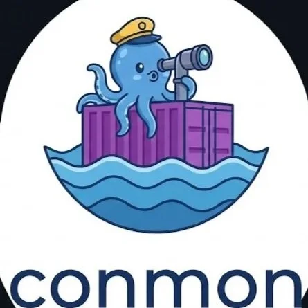
Me: Can you make the logo look like it belongs in this set of other container logos?
AI: I'm analyzing the style of the container tool logos, with a focus on their circular icons and associated text formatting. I've noted a consistent use of clean fonts and a friendly, cartoonish illustration style.
*This is actually probably the first thing that I’ve been surprised to like. However, I’m not sure if that’s because it now has the container logos as a reference. I spent some time afterwards cross-referencing the cute cartoon octopus online to ensure it wasn’t completely from one source. *
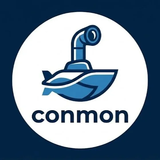
Me: Can you make the first image generated look like it belongs in the set of logos, without the octopus and the container, but keeping the periscope and submarine
AI: Here is Option 3. I'm working on refining the submarine and periscope design. The aim is a flat vector graphic, so I'm removing textures and gradients for a cleaner look. I'm ensuring consistency with the other logos. The goal now is a dark background.
*Again with this one, I was pleasantly surprised, but similarly to the Hummingbird logo, it’s 1 colorway, and I want to see more.*
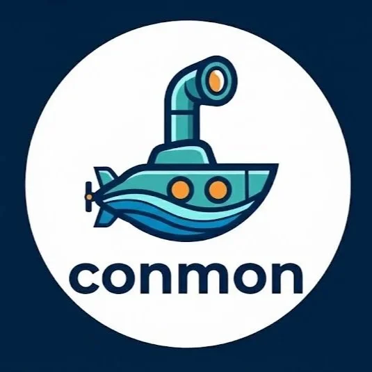
Me: Okay, can you make it a little more colorful?
AI: Here is Option 4.
*Here I was disappointed that it changed the aspects from 3 that I liked. It seems to sacrifice certain things to change something unrelated at times. I liked about 75% of the lineart on Option 3, but it changed too much between iterations.*
Post AI Thoughts:
This round of visuals was done with what I understand to be a newer model of Gemini, called Nano Banana Pro Limit. It definitely felt like there was a difference at times. I like certain aspects of what it came up with, but I can also really easily look up photos of submarines or submarine icons to reference just as quickly as AI can. Sometimes simplifying something for a logo can be a really hard task, and I can tell AI is still learning the balance of that. I can’t quite tell if it does save me time or not.
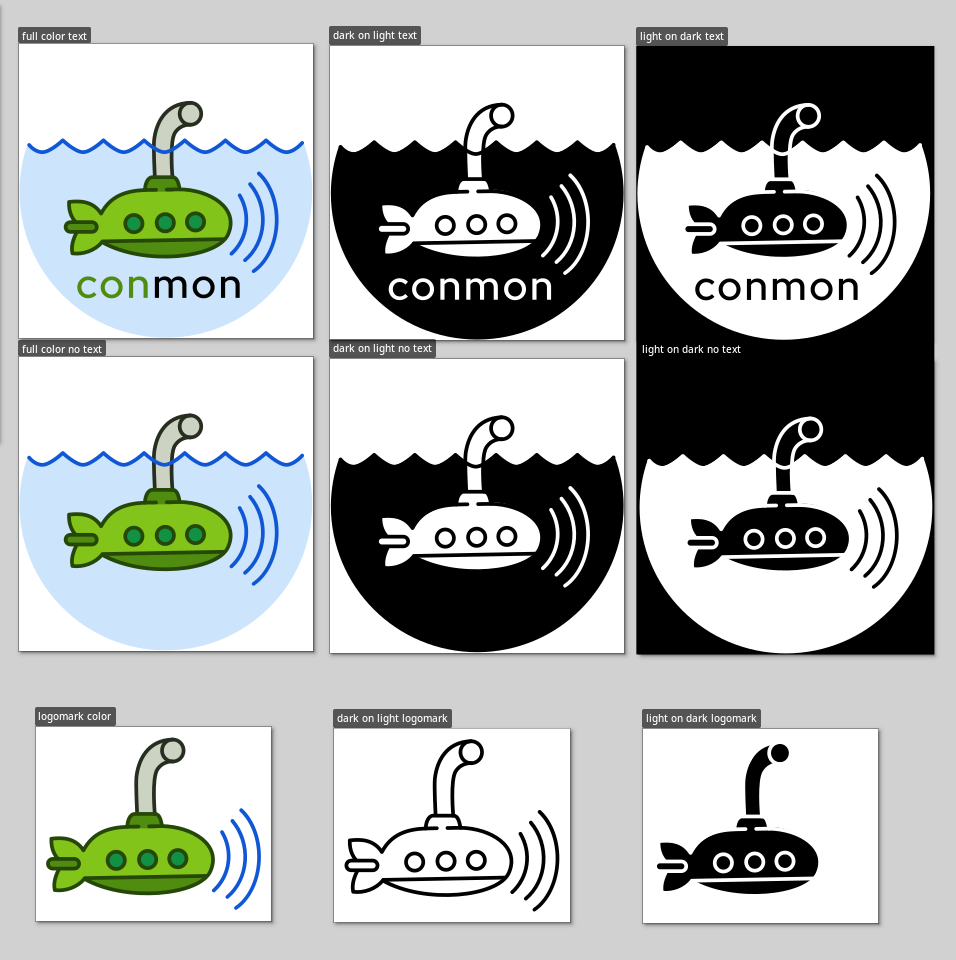
The final 9 iterations for the conmon logo
Let me know if you’re a designer and how you use AI! For F44 Wallpaper we had some AI generated visuals that were apart of the mind map in our research and development phase, where we figure out what visual direction to go in. Hopefully you now can see and understand a little bit of what goes behind the scenes for design requests like these!